Working with Hero Image Height in Mobile Browsers
Published
Nowadays, setting a hero image to full height is as easy as attaching a height: 100vh CSS rule. While this works great on desktop browsers, things are a bit more complicated on mobile devices due to their disappearing address bar.
Mobile Device Viewport Height is Unpredictable
While mobile browsers honor the height 100vh CSS rule, styling elements at the top of mobile pages is problematic due to the the URL Address Bar. The bar is present on Apple and Android devices, any only disappears when scrolling down the page.


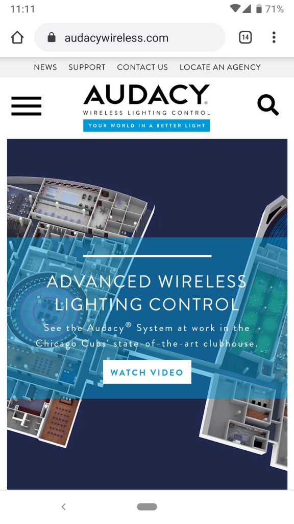
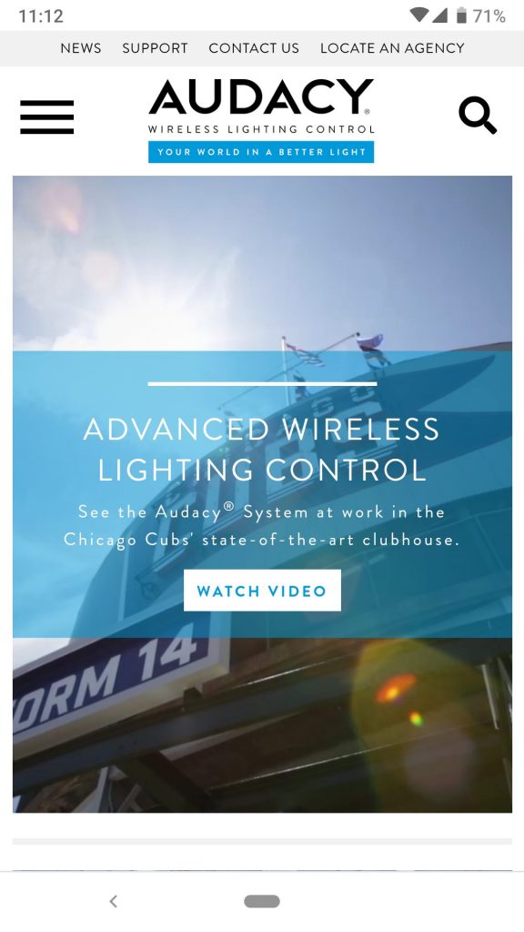
The images above show a hero background video that is intended to stretch the entire height of the mobile viewport. The intended design is shown on the right image, and is only realized when the Address Bar is hidden. The image on the left shows what the page looks like with the Address Bar visible; the hero video is cut off at the bottom, and the blue text overlay is not vertically centered.
A Pure CSS Solution
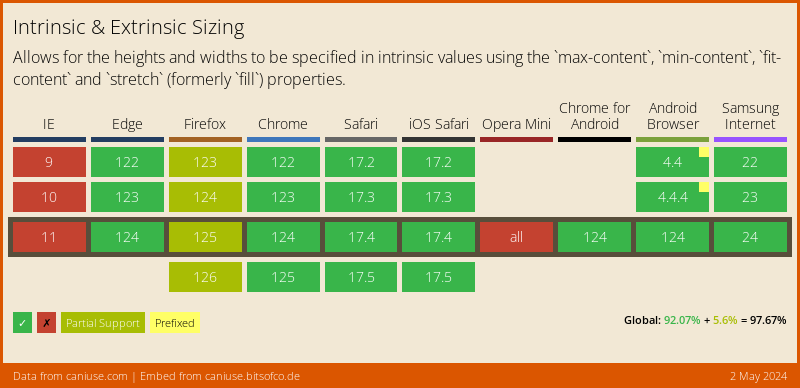
Fortunately a CSS-only solution with pretty good browser support has emerged. It takes advantage of CSS Intrinsic Sizing, a new concept to me that I am excited to work with.
The CSS-only solution allows for easy vertical alignment of text overlay content, and absolute positioning of other UI elements based on the true height of the hero image.
Here is a set of cross-browser CSS rules that will set the element height to the match a mobile device’s viewport height (also works on desktop):
img {
  height: 100vh;  // fallback and unsupported browsers
  height: -moz-available;  // Mozilla-based browsers
  height: -webkit-fill-available; //  WebKit-based browsers
  height: fill-available;
}
JavaScript Solutions
I came across different JavaScript fixes that could be used to set hero image height, or help position UI elements properly based on true viewport height. While these solutions are generally not as clean as applying the CSS rules above, they may be helpful in certain circumstances.
Dynamically Setting the Image Height
JavaScript can be used to set the hero image height to match the viewport height at page load. In the code snippet below, Line 4 sets the image height, while the surrounding function declaration and event listener ensures the image size is reset if the screen/window is resized.
// wrap in function and bind to window resize events
const setHeroHeight = () => {
  // set the image height to viewport height
  document.querySelector('.hero-image').style.height = window.innerHeight
}
window.addEventListener('resize', setHeroHeight)

// call at page load
setHeroHeight()
Positioning UI Elements with JavaScript
The absolute positioning of UI elements can be tricky if the hero image stretches longer than the viewport. Elements may be cut off whenever the Address Bar was visible.
Fixed positioning can be applied to UI elements until the bottom of their parent hero image is scrolled into view. At that point, absolute positioning is applied to the navigation elements (to ensure the remain in the hero image). The desired effect is:
This was fairly straightforward to accomplish using a JavaScript scroll event listener:
// select the node containing the UI navigation elements for callback function closure
const navigationContainerElem = document.getElementById('navContainer')
window.addEventListener('scroll', function(e) {
  if (window.scrollY > 0) {
    // if user has scrolled past 0, absolute position elements inside the hero image
    navigationContainerElem.style.position = 'absolute'
  } else {
    // otherwise set fixed positioning if still at top of the page
    navigationContainerElem.style.position = 'fixed'
  }
}
Here is the same logic, but with IntersectionObservers instead. While there may be a performance benefit over traditional event listeners, I found the toggling between styles to be a bit more noticeable:
// select the node containing the UI navigation elements for callback function closure
const navigationContainerElem = document.getElementById('navContainer')

// configure intersection observer to fire when hero image no longer fully visible
const observer = new IntersectionObserver(function(entries) {
    entries.forEach(entry => {
      if (entry.intersectionRatio > 0) {
        // complete hero image no longer visible - absolute position navigation elements inside the hero image
        navigationContainerElem.style.position = 'absolute'
      } else {
        // complete hero image is visible - set fixed positioning since at top of the page
        navigationContainerElem.style.position = 'fixed'
      }
    })
  },{
  threshold: [0,.01]
})

// observe the DOM element right AFTER the hero image
const aboutMeElem = document.getElementById('about-me')
observer.observe(aboutMeElem)
Comments
No responses yet