Responsive Images, and how to Serve them from WordPress
Published
The Case for Responsive Images
Modern browser standards make it easy to include “responsive images” on your pages. By this I mean the capability to serve images that are correctly sized to match the devices they are be rendered on. Consider mobile devices, with smaller screens, and often slower Internet connections; makes sense to serve a smaller image to these users for increased performance and faster page load time, right?
There are many advantages to this approach including:
- Reduced overall page size, saving bandwidth for you and your user
- Faster page load speed, which is important for users when determining if they will stay or go1
- Better SEO page ranking2, and Google PageSpeed Insights ranking
Google announced that they are switching to a “mobile-first” index3, meaning the scoring of mobile sites is becoming the primary determinant of search ran. Serving speedy and mobile-ready sites is more important than ever!
I’ve implemented responsive images on my personal site over the last month or so. Research on image formats and methods of inclusion was required, in addition to a lot of digging around in the WordPress documentation. I created this guide detailing the steps I took – hopefully they are helpful for anyone else looking to incorporate responsive images into their site!
1. Determining the Best Responsive Image Sizes
I started off by researching the most popular screen sizes for both mobile and desktop users4. I used the max width for my site’s content section as an upper boundary; my site’s page content sections never exceed a width of 1024 pixels, so I knew I would never serve an image larger than that.
I identified the following screen sizes as most popular:
- Mobile: 400px (leaving some buffer for mobile screens ranging from 360-400px)
- Responsive: 768px
- Desktop: 1024px (again, this was guided by the maximum width of my site template; had my page theme been wider I would have probably expanded this up to 1366px)
2. Creating Responsively Sized Images in WordPress
WordPress automatically creates different size thumbnails for all images uploaded to the Media Gallery. I needed to tweak the default settings to ensure the thumbnails being created matched my sizes determined in the last section. I navigated to the Settings > Media section in my WordPress Admin and configured the thumbnail sizes appropriately.
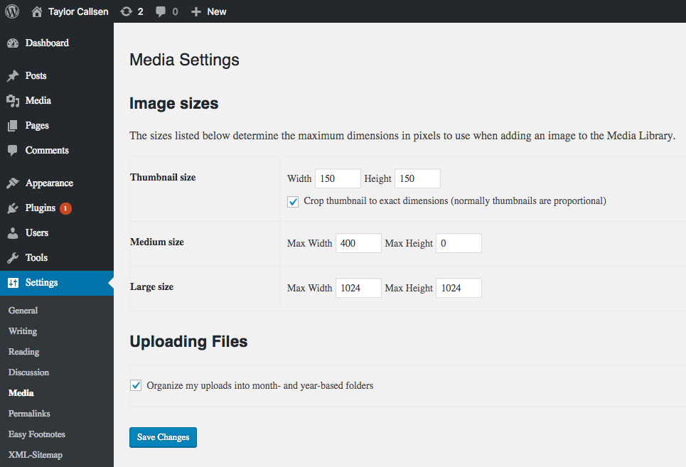
The “Max Height” of 0 set on the Medium Image size means that thumbnails were not bound by height. The ensured that a 400px mobile rendition of the image would always be available. One additional image size is not shown in the admin menu called the “medium_large” size (added by default in WordPress 4.4), which is conveniently set to 768px wide with no height limit.
These new image sizes are only applied to future images, and required use of the Regenerate Thumbnails plugin to generate them for images already included in my library.
Note: after regenerating thumbnails, “old” or existing past thumbnails still remain on the file system and are still linked to the image in WordPress via it’s Post Meta.
3. Including Responsive Images in HTML: Image Srcset vs. the Picture Element
There are two browser standards that enable responsive images to be included in HTML. First is the <picture> element, and the second is the image srcset attribute.
There has been debate over which method is better, and of course there are pros and cons. For the majority of use-cases, the image srcset gets the job done with less complication, and better browser support (the <picture> element is still not supported by IE without a polyfill).
I’ve seen the <picture> element referred to as “the big guns”, and allows for more precise control over which version of an image is loaded (the srcset attribute simply specifies “guidelines” that the browser should follow). The <picture> element also supports the WebP image format, backed by Google, which enables progressive loading by default. WebP does show promise, however as of now it lacks browser support outside of Chrome.
Since version 4.4, WordPress has built-in support for the image srcset featuring the different image sizes we covered in the previous section5.
4. Introducing the Image Srcset and Sizes Attributes
The Image srcset took me a while to understand, but the page load-time improvements are were worth it, especially on bandwidth strapped mobile devices. In essence, the image srcset (and <picture> element) provide the browser with several alternative image URLs of varying sizes, along with a snippet of CSS that tells the browser what size the image will be at the different screen sizes.
<img class="wp-image-568" src="/wp-content/uploads/2018/04/IMG_20180426_132150-1024x768.jpg" alt="" width="720" height="540" srcset="/wp-content/uploads/2018/04/IMG_20180426_132150-1024x768.jpg 1024w, /wp-content/uploads/2018/04/IMG_20180426_132150-400x300.jpg 400w, /wp-content/uploads/2018/04/IMG_20180426_132150-768x576.jpg 768w" sizes="(max-width: 442px) 400px, 720px">
From there, the browser uses the CSS (specified in the “sizes” attribute) to determine what size image it needs to load to cover the pixel dimensions of the container (the different sizes are provided in the “srcset” attribute). For a more in-depth explanation, see this very commonly cited article on the subject.
5. Limiting WordPress’s Srcset Attribute to the Current Image Sizes
WordPress will generate the srcset attribute automatically, however since I specified custom image sizes, I needed to filter the srcset to remove the past image thumbnail sizes (WordPress maintains the past image size associations in the image’s Post Meta with a “legacy” or “old” denotation).
This was accomplished by adding the following code snippet my theme’s functions.php, which filtered each image’s Post Meta to only include the current active image sizes. As you’ll see, this snippet makes use of the “wp_get_attachment_metadata” WordPress hook.
// remove non-current image sizes from image post meta
function correct_image_meta_data( $data ) {
  // limit to only when displaying images on post/page
  if(is_single() || is_page()) {
    foreach ($data['sizes'] as $property => $value) {
      // check to ensure image size is in WordPress's current intermediate image sizes
      if (!in_array($property,get_intermediate_image_sizes())) {
        unset($data['sizes'][$property]);
      }
    }
  }
  return $data;
}
add_filter( 'wp_get_attachment_metadata', 'correct_image_meta_data' );
6. Deriving the Sizes Attribute for my Custom WordPress Theme
The Sizes attribute is also generated by WordPress by default, however it is always recommended that this property be considered whenever creating a custom theme. It communicates to the browser the possible image sizes, as well as a maximum size that is never exceeded.
In my theme, images never exceed 982 pixels, as the content space has a max-width of 1024px, which includes 42 total pixels of left & right padding; I used this value as my absolute maximum.
For the remainder of the possible image sizes, I loop through the 3 optimal sizes identified in section 1, and include them in the $sizes string if the examined image has a rendition larger than the renderd image size (this helps in cases where a max-width is applied to the image in the WYSIWYG editor, and the larger image renditions will never need to be served).
The complete snippet is below, and makes use to the “wp_calculate_image_sizes” WordPress hook.
// generate image sizes attribute based on image sizes and any applied max-width
function adjust_image_sizes_attr( $sizes, $size ) {

  // define template image sizes at each breakpoint
  $templateSizes = array(
    400=>"(max-width: 442px) 400px",
    768=>"(max-width: 810px) 768px",
    1024=>"982px"
  );

  // loop through $templateSizes and add the various breakpoints to $sizes string if needed
  $sizes = '';
  $keys = array_keys($templateSizes);
  for ($i = 0; $i < count($keys); ++$i) {

    // pull width out of function parameters
    $width = $size[0];

    // add breakpoint to sizes if image width is larger than breakpoint
    if ( (int)$keys[$i] < $width ) $sizes .= $templateSizes[$keys[$i]] . ", ";
    // otherwise, set max image width and break out of loop; max width is either
    // user specified width in WYSIWYG or max breakpoint size (whichever is smaller)
    else {
      $sizes .= ($width < $keys[count($keys)-1]) ? $width . "px, " : $templateSizes[$keys[count($keys)-1]] . ", ";
      break;
    }

  }

  // remove trailing comma
  $sizes = rtrim($sizes,", ");

  // return $sizes to be used in HTML img tag sizes attribute
  return $sizes;
}
add_filter( 'wp_calculate_image_sizes', 'adjust_image_sizes_attr', 10 , 2 );
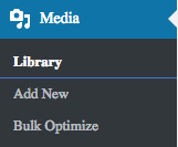
7. Bulk Optimizing All Images
Once the different image sizes are created and being included in the WordPress posts correctly, the last step is to use a WordPress plugin to bulk optimize all images and their various thumbnail versions. There are many different image optimizers out there, both free and paid. I ended up going with the EWWW Image Optimizer Plugin because it was free and easy to configure. I simply installed the plugin, and navigated to the “Bulk Optimize” area of my Media Library.
8. Realizing the Performance Gains
After all of this work, I made darn sure to check my site to make sure the performance benefits from the responsive images were being realized. I cared most about the mobile users, since they were the most bandwidth constrained.
I chose a post that had a lot of images, and took a screen capture of the behavior before any image srcset or optimizations has been introduced:

Wow! Over 1 megabyte of images served to each user that visited the page. That was entirely too much, especially for mobile users.
Let’s see how things change after introducing these image optimization techniques:
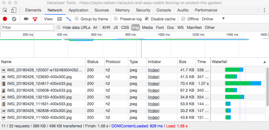
After introducing the image srcset and optimizations discussed in this guide, I was able to correctly serve responsive images to mobile users, reducing this page’s site footprint by over 60% (notice the 400×300 on the end of the image filenames – that is our image srcset in action). The great thing about using WordPress, or other CMSs, is when you make this change in one place, the updates are applied site-wide!
Comments
No responses yet