Incorporating WebP Images into Websites
Published
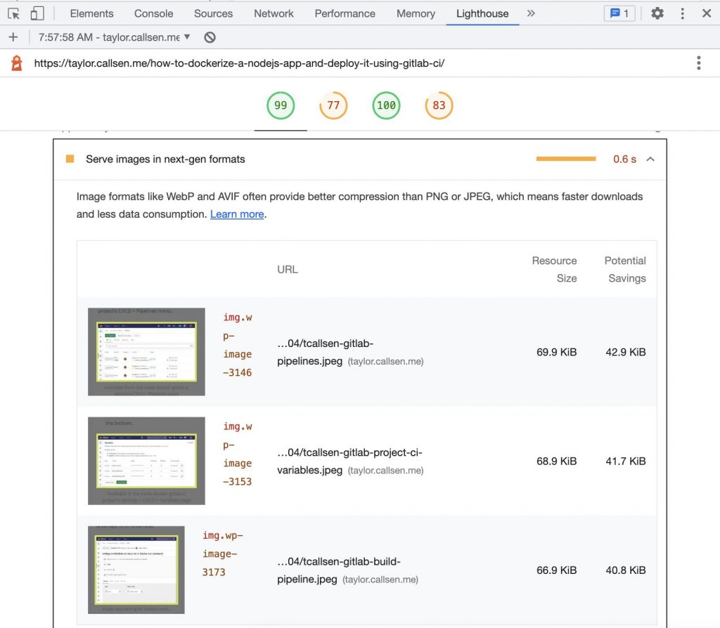
Lately at work we’ve been paying a lot of attention to website performance, and using Google Lighthouse scores as a key indicator. After running the audit here on my personal blog, the bandwidth savings from serving images in “next-gen formats” such as WebP or AVIF stood out as straightforward way to improve my page load time.
The following post is based on my research of how to best incorporate WebP images into my blog. This included things like potential performance improvements, backwards compatibility, and confirming HTML syntax and browser <source> selection. Please feel free the comment at the bottom if anything is contrary to your findings/experience. I am here to learn, just like you!
Why WebP
After researching WebP, I became aware of a few advantages:
- Reduced File size compared to existing formats – studies performed by Google indicate that WebP is ~26% smaller compared to PNG 1, and 25-34% smaller than JPEG 2.
- Improved Performance and Lighthouse score – While the industry generally believes Lighthouse scores do not impact Google Search rankings 3 4, an improved Lighthouse score correlates to a faster page load and a better experience for the end user.
- Excellent Browser Adoption – WebP has the best browser adoption available for next-gen formats, with support for ~94.9% of browsers 5 at the time this post was written. This is much better than other next-gen formats like AVIF (currently at around ~81% support 6).
Converting Images to WebP
Google has released an open source command line tool called cwebp that is the de facto standard utility for converting images to WebP formats. Many guides exist out there with example command syntax, including some published by Google.
Web platforms such as WordPress also have numerous plugins that will handle the WebP conversion automatically. I have had great experience using the EWWW Image Optimizer plugin on this site, and have also seen mention of other plugins like Converter for Media – there are certainly many options out there!
Including WebP Images in Website HTML
The preferred method for including WebP images in websites is to use the <picture> element because it allows us to lay out all available sizes/formats of an image, and let the browser choose the best one given the client device/context.
The <picture> element also provides backwards compatibility for browsers that either do not support WebP, or do not recognize the <picture> and/or <source> elements. In the latter case, the <img> element is interpreted and used.
<picture>
   <source type="image/webp" sizes="(max-width: 660px) 600px, (max-width: 1084px) 1024px, 1200px"
     srcset="https://taylor.callsen.me/wp-content/uploads/2023/04/tcallsen-pallisades-fingers-mar-2023-400x300.jpg.webp 400w,
             https://taylor.callsen.me/wp-content/uploads/2023/04/tcallsen-pallisades-fingers-mar-2023-768x576.jpg.webp 768w,
             https://taylor.callsen.me/wp-content/uploads/2023/04/tcallsen-pallisades-fingers-mar-2023-1024x768.jpg.webp 1024w,
             https://taylor.callsen.me/wp-content/uploads/2023/04/tcallsen-pallisades-fingers-mar-2023-1536x1152.jpg.webp 1536w,
             https://taylor.callsen.me/wp-content/uploads/2023/04/tcallsen-pallisades-fingers-mar-2023-2048x1536.jpg.webp 2048w">
   <img type="image/jpeg" sizes="(max-width: 660px) 600px, (max-width: 1084px) 1024px, 1200px"
     srcset="https://taylor.callsen.me/wp-content/uploads/2023/04/tcallsen-pallisades-fingers-mar-2023-400x300.jpg 400w,
             https://taylor.callsen.me/wp-content/uploads/2023/04/tcallsen-pallisades-fingers-mar-2023-768x576.jpg 768w,
             https://taylor.callsen.me/wp-content/uploads/2023/04/tcallsen-pallisades-fingers-mar-2023-1024x768.jpg 1024w,
             https://taylor.callsen.me/wp-content/uploads/2023/04/tcallsen-pallisades-fingers-mar-2023-1536x1152.jpg 1536w,
             https://taylor.callsen.me/wp-content/uploads/2023/04/tcallsen-pallisades-fingers-mar-2023-2048x1536.jpg 2048w"
     src="https://taylor.callsen.me/wp-content/uploads/2023/04/tcallsen-pallisades-fingers-mar-2023-1024x768.jpg">
</picture>
The best practice is to list the preferred image formats first (e.g. WebP), with the rendition sizes in the srcset in ascending order (smallest images first). The sizes attribute is dependent on the actual website where the HTML is being included; for more information on the sizes attribute checkout the excellent docs on Responsive Images by Mozilla.
Given all this fancy HTML syntax, we know that older browsers will ultimately load the image in the src attribute of the <img> tag.
CSS Styles on the Img tag apply to the Source
I was very pleased to find out that any CSS styles that are applied the <img> tag will be automatically applied to whichever <source> image is selected. This is because the selected image will be presented in the same space/block occupied by the <img> element 7. This made introducing WebP images into a website with existing CSS styles much easier.
Confirming WebP Images are being Included
There are a couple different methods to confirm that WebP images are being included in the webpage, and the appropriate source size is being chosen by the browser.
Check Google Lighthouse
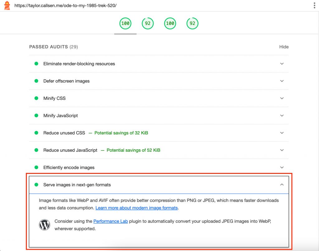
The simplest test is to run a Lighthouse audit on the website from within Chrome DevTools, and confirm that the “Serve images in next-gen formats” audit passed successfully. This process is outlined in more detail here.

Use DevTools to Monitor Source Selection
I also used the responsive view in Chrome DevTools to confirm my HTML syntax is correct. In this view, we can simulate different client screen sizes and resolutions to see which source size will be selected. We can use this to tweak and confirm the sizes and srcset attributes on our <picture> element.
Don’t forget to test with different Device Pixel Ratios (DPR) – here are steps to enable this in DevTools.


Comments
No responses yet